Field note 02
The First Ninety Seconds
5 min read
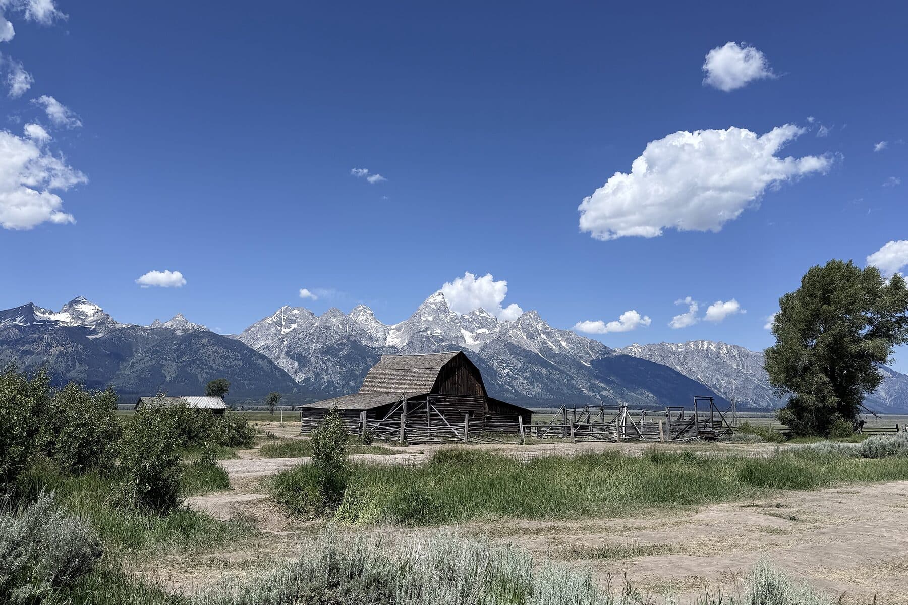
Every park, every event and every homepage is won or lost at the threshold.
There is a moment, very early, when a person decides how much of themselves to give you.
At a national park it happens at the entrance station. At an event it happens between the door and the first thing you are allowed to see. On a website it happens above the fold. It is short — call it ninety seconds — and everything you build afterwards is either carried by what happened in it, or fighting it.
We spend our budgets downstream. The stand, the keynote, the product page, the deck. All of it sitting behind a threshold nobody was ever assigned to design.
What a threshold actually has to do
Confirm they are in the right place. This sounds trivial until you watch someone hesitate in a doorway. Certainty is the first thing you owe a guest.
Show the shape of what is ahead. A park map does this in three seconds: here is the scale, here are your options, here is roughly how long this takes. Most events and most homepages make people guess.
Remove exactly one friction. Not five. One — the one that is genuinely in the way. Coat, badge, password, parking. Removing one thing well beats a smooth-sounding list nobody executes.
Make a promise the next five minutes can keep. A threshold that oversells is worse than a plain one, because the disappointment lands immediately and colours everything after it.
Three thresholds, one problem
The park gate slows you down on purpose. It knows you arrived at speed and it will not let you take that speed into the canyon.
The event door is where I have made my most expensive mistakes. At WINDOW we eventually spent more attention on the first twenty metres than on any single stand in the hall — because a guest who arrives confused stays cautious for the entire evening, and a cautious guest does not start conversations. The whole commercial model of that format depended on people talking.
The homepage is a threshold that most companies treat as a poster. It should behave like the park gate: orient, promise, remove one obstacle, and let the visitor set their own route.
Six questions to audit your own
1. What is the very first thing a person sees — and did anyone actually choose it?
2. How many seconds pass between arrival and the first moment of orientation?
3. What are they holding, physically or on screen, in the first minute?
4. Which friction did we remove — and which did we keep because it was convenient for us?
5. What promise does the threshold make, and do the next five minutes keep it?
6. If we deleted everything except the first ninety seconds, would anyone still know who we are?
The uncomfortable part
The threshold is almost always the cheapest thing on the plan to fix, and almost never has an owner. There is a person responsible for the stage and a person responsible for the catering and nobody responsible for the first ninety seconds — which is the only part every single person experiences.
Give it a line in the budget and a name on the plan. It is the highest return available to you, and your competitors are still spending theirs on the stage.
- Experience Design
- Brand Strategy
- Field Notes